
When you spend on flower pots, think about it as an investment in your decor. Color is so influential in our everyday lives that it helps to define our experiences. Think of the reds and oranges that create sunsets, or the blues and whites that denote peace and tranquility, the earthy browns that are nice on the eyes, and the professionalism of black.
As we will discuss in this blog, choosing the best color for flower pots is a delicate and dedicated job. This blog aims to give you some inspiration and make it an easy and interesting experience along the way.
Why is the color of plant pots important?
The color of plant pots can be a big factor in the message that you are trying to deliver. Plants are used to pepper our homes, our offices, and gardens with beautiful and immensely important pockets of life.
The plant pot is a necessary extension of the plant itself and can pull a room or garden out of obscurity with the right shape and tone that blends all the design together.
Plant pots can be commissioned in entrances, waiting rooms, lounges, gardens, bathrooms, and any other commercial or residential space you can think of to bring color in a practical and natural way. Mobilizing the humble plant pot is one of the best ideas to address the color in your decor or in your garden.
But that’s not all. Planter colors can also affect the health of your plant. In fact, there are many factors that go into the best plant pot.
An introduction to color theory
The science that color has an order or a set of mathematical rules might not be new to you. In classical theory, for example, the primary colors which include red, yellow, and blue, make the backbone of the color wheel. Mixing these colors together creates the secondary colors and so on.
The more contemporary view of color is that it is a means of communication. With skillful navigation of the color wheel, artists have used color theory to tug on the emotions of the viewer, creating visions that embolden, sadden, and intrigue.
Designers have used color theory to lure the appetites of customers, tapping into the unconscious mind to catch the eye, make a statement, or reinforce brand identity. Think of the bold yellow and red of the McDonald’s sign as a great case-in-point of how color can bring customers to the point of sale.
Create a color scheme
Classical color theory is used in the foundation and formation of color schemes. The most popular color schemes fit into these 4 categories; analogous, monochromatic, complementary, and triadic.
All of them use patterns of color that are calculated from the color wheel. Other decor styles like minimalism utilize cooler and more toned-down combinations. Let’s look at these style ideas more closely.
Analogous
This color scheme utilizes colors that are positioned side by side on the color wheel. Choosing different locations on the wheel will have a different psychological effect. For example, orange and red, which are closely related, can add to the warmth in your room. Blue and green shape feelings of tranquillity and yellow and green are very natural and happy in their tone.

Monochromatic
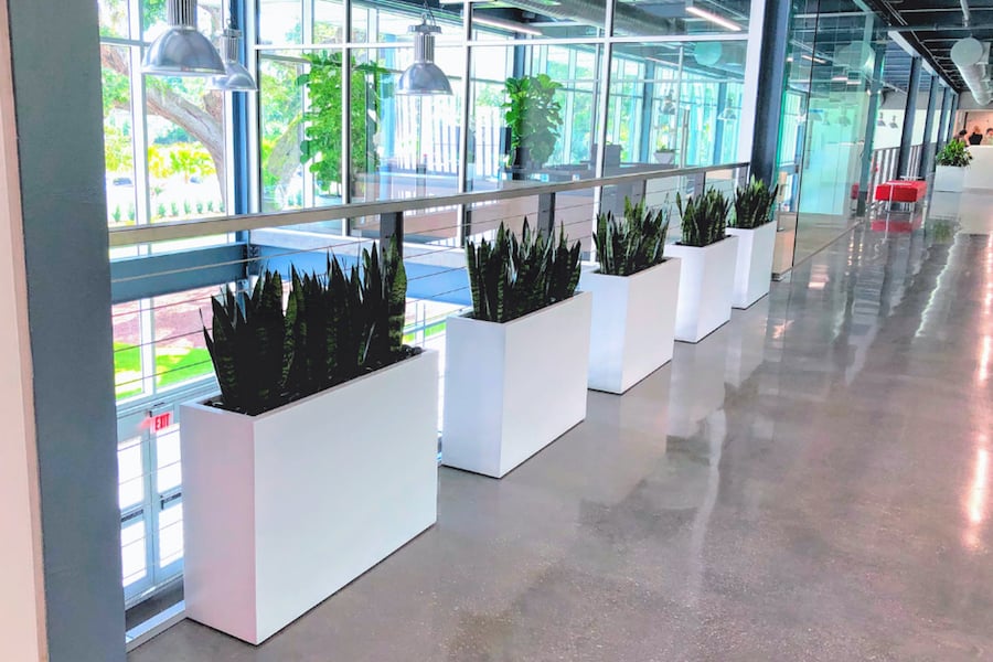
A uniform style consisting of one color can set the tone of the whole room. A monochromatic color scheme can look very professional when using the darker side of the spectrum, like navy blue, grays, and blacks. Think of a corporate office space whose color scheme needs to sit quietly and politely while the rest of the office is busy and chaotic.

Monochromatic schemes are a great starting point to build upon with more complex combinations later on. If you already have a monochromatic style in your room and you are not sure what color to choose next then it is quite safe to pick a color that is closely related in hue and tone to the existing look.
Complementary
When looking at the color wheel, complementary colors are opposite to each other. Think how a powerful orange pot next to a blue wall is going to make a design statement reminiscent of Andy Warhol. Though described as complementing, these colors can become quite contrasting if both are dominant. For example, equal parts of red and green can be quite the eyesore. Try instead to lift the room from drab to vibrant with a reduced focus on the complementing color.

Triadic
As the name suggests, this scheme involves a triad of colors that are located an even distance from each other on the color wheel and creating a triangle. The most basic of these combinations is the yellow, blue, and red that make the primary colors. Using all three in equal parts is rather lively and a more toned-down approach would be to pick a dominant color, while the other two colors are there more for emotional support than to steal the show.

Minimalist
Minimalism began in the post-war era as a cultural revolution that discarded bold and bright colors and settled down into what we now think of as a modern color palette. Minimalism employs the lighter shades of most colors with the aim to fade into the background and provide a backdrop for other elements of your decor. A typical minimalist design will have two or three secondary tones like an earthy brown, faded pink or green, or a watery purple. White is often the most dominant in the color combination.
Matching to the season
Seasons change and with them so can your design. A diligent gardener will use the season to inform their choice in garden decoration. Utilizing the color of the plant pot is one of the easiest ways to get the vibe that you are after as plant pots are easily accessible and deployed, and can be stored until used again when necessary.
Spring and summer
Decor in this time of year is usually upbeat and bright. Using a triadic or complementary color scheme in this season would really go a long way to creating a cheerful and warm atmosphere. If you have a beautiful bouquet of bright yellow flowers, consider a blue planter to contrast and bring attention to your foliage. A monochromatic scheme of cool colors such as white will feel refreshing after the hot summer sun.

Fall and winter
In these darker and cozier months, earthy colors really come into play. Colors such as brown and yellow conjure up all the wonderful visions of an ombre forest, while darker oranges and reds are warm and more decadent.

The main colors of interest
Black
Black is a staple in any decor scheme. It can be used to quietly contrast with other brighter tones or give the room a touch of professionalism and bring the other funky colors in your room into a sophisticated ensemble. The enormous power that black has in its depth and cultural importance makes black an instant eye-catcher while still maintaining the formality of a gentleman, perfect for the office or corporate setting.

White
Our collective cultures have given white the identity of purity and innocence. It is light, can aid inspiration, and yet it is soft and sleek. Minimalist interior designers will often use white to form the backdrop for more complex tones. White is also an effective tool to highlight other features of decor in your room while remaining neutral in the overall color scheme. A little splash of white in the form of a flower pot can be an accent, whereas an array of white tones will nudge your decor towards a more monochromatic elegance.
Gray and silver
Gray and silver have been popular colors in recent years as more and more corporate and commercial spaces utilize the raw infrastructure of their premises in the decor. Metal pipes and steel posts are now left exposed as the industrial design revolution gains pace. Gray and silver are often the quiet and sleek backdrop to the busy comings and goings of commercial areas and won’t jostle for the attention of consumers.

Brown
Brown is a very natural color that is found in every landscape and terrain the world over. Brown is the color of life as much as it is green and the two colors go hand-in-hand. We as humans are humbled by brown, warmed by brown, and can unwind in its earthy charms. Due to this close relationship we have, brown can be used to signal warmth and friendliness and is a fantastic color to use in lounges and bedrooms.

Create a balance
A painted flower pot be instrumental in blending your decor together. A good rule of thumb is to go with the color proportions of 60-30-10. The majority of your color scape should be a dominant color, around 60%. A secondary color should take up the next 30%. The last 10% is reserved for accents. This is the final color in your scheme that complements or subtly contrasts the others.
Use your painted planter as a pawn to go where you see fit. If you need a little more jazz then go for a contrast. Whereas, if you want to add to the foundation of your scheme then figure out what tones you want to be dominant.
A few ideas about the location
The location of your planter will have an impact on the colors that you have at your disposal. First, let’s look at containers that are outside.
Outside
Colored plant pots in the garden or in exterior areas will have to contend with the elements. Dark-colored pots will absorb and retain the warmth of the sun for longer. This is great in cold weather and can eek a little more growing time out of your season. During the summer months, though, a dark-colored plant pot will get very hot and dry and it might be best to switch to a light tone to keep your plants cool or move them to a shadier spot in the garden.

Inside
You don’t have to worry so much about how the paint will affect the container with indoor plants. Most indoor plants will be away from direct sun and therefore the darker shades of paint are available to use year-round. Small pots on windowsills and baskets of foliage can bring the garden into your building. One idea is to use these little pots to splash in the less common colors such as pink, purple, blue, and green.

What is the best paint to use on plastic flower pots?
The paint used for plastic and fiberglass flower pots is specifically manufactured to work with plastics. Some companies have developed purpose-built formulas to get the best results. Rust-Oleum Painter’s Touch Spray Paint is a good choice. Here’s a quick guide to painting your fiberglass products to extend your investment!
In this case, it’s better to ask the question, what material should I use?
When comparing planter materials, fiberglass always wins. While plastic is cheap, fiberglass is more durable and will maintain the finish of your product for longer. They are also much more sustainably made too. That’s why it is a foundation in our planter design.
Our company
We are specialists in the production and delivery of high-quality fiberglass planters. We chose this material for a number of reasons including its superb ability to hold a fantastic painted finish with a huge range of colors that we can apply in-house.
Quality control in all of our materials and manufacturing plants has ensured we stay a leading worldwide supplier of commercial and residential planters. All of our products are handmade and our dedicated designers can work with you on any particular specification that you have.
If you would like to find out more about this and see how our company can help you, why not first see how fiberglass planters are made in our factory!